


Meet some of our past customers…
ONeil’s Handyman Service


For O’Neil’s Handyman Service, based out of Wimauma, Florida, I designed a set of flyers and business cards that reflect both the professionalism and the approachable personality of the business owner, Narian O’Neil. With Narian being the sole handyman behind the operation, it was important to emphasize reliability, friendliness, and a local touch in the visuals and messaging. The flyers were designed to catch attention quickly with clear service offerings, contact information, and a layout that balances eye-catching design with readability. I used warm, earthy tones and approachable fonts to complement the trustworthy and good-humored nature of Narian himself.
Creating these materials wasn’t just a design task—it was a personal mission. I’m extremely passionate about supporting the rise of small businesses, especially those run by hardworking individuals like Narian who bring both skill and heart to their trade. Every detail, from the logo placement to the language used on the business cards, was chosen to give O’Neil’s Handyman Service a polished, memorable identity while staying true to its grassroots charm. Working on this project was not only creatively fulfilling but also deeply meaningful as I contributed to helping a local entrepreneur grow and thrive.
Patricia Campbell


For Patricia Campbell, an Independent Sales Director with Mary Kay, I created a promotional flyer to advertise a tiered discount sale she was hosting around the July 4th holiday. The flyer was designed to clearly present the hourly discounts, ranging from 60% off early in the morning to 5% off by late afternoon, encouraging early engagement and building urgency throughout the day. The layout featured a clean, readable structure so customers could easily identify the best times to shop. I also highlighted the added incentive—a raffle entry for an Amazon gift card with any $200 purchase—to maximize customer participation and product sales.
Patricia’s energy and entrepreneurial spirit inspired the look and feel of the design. I wanted the flyer to feel dynamic yet professional, aligning with the Mary Kay brand while showcasing her personal commitment to her clients. As someone passionate about empowering small-scale entrepreneurs, especially women in direct sales, I took care to craft a flyer that not only communicated the details of the event effectively but also elevated Patricia’s presence as a trusted and engaging beauty consultant.

Rows & Rows Lavender Farm
This label design was created for Kathy, a vendor at the South Bend Farmers Market and the heart behind Rows & Rows Lavender Farm. With a soulful, earth-connected spirit, Kathy crafts her “Lavender Mist” as a natural sleep aid using ingredients like lavender, chamomile, and melatonin. The design was intentionally soft and calming, using a gradient of lavender and sage green to evoke tranquility. I incorporated delicate floral elements and gentle curves to mirror the soothing essence of the product while maintaining an earthy elegance that reflects Kathy’s deep respect for nature.
I also looked into Rows & Rows Lavender Farm to bring more authenticity to the design. Located near South Bend, Indiana, Kathy’s farm opens a U‑pick lavender field on Thursdays and Fridays from 10 AM to 4 PM and actively demonstrates lavender planting at the market. She often invites customers to explore the “back 40 acres,” sharing the beauty of her rows of lavender in full bloom. This hands‑on, educational, and immersive approach inspired me to emphasize the handmade, farm‑to-bottle story on the flyer—so purchasers feel connected to the place and the person behind the mist.
Designing for Kathy was a grounding and fulfilling experience. Her passion for holistic wellness and natural remedies shines through in everything she makes, and I wanted this label to do justice to that intention. Every element was chosen to match her vibe—from the whimsical yet legible font to the organically curved frame—ensuring it felt handcrafted yet professional. Supporting vendors like Kathy means more than just design work; it's about helping amplify voices that truly care about people and the planet.
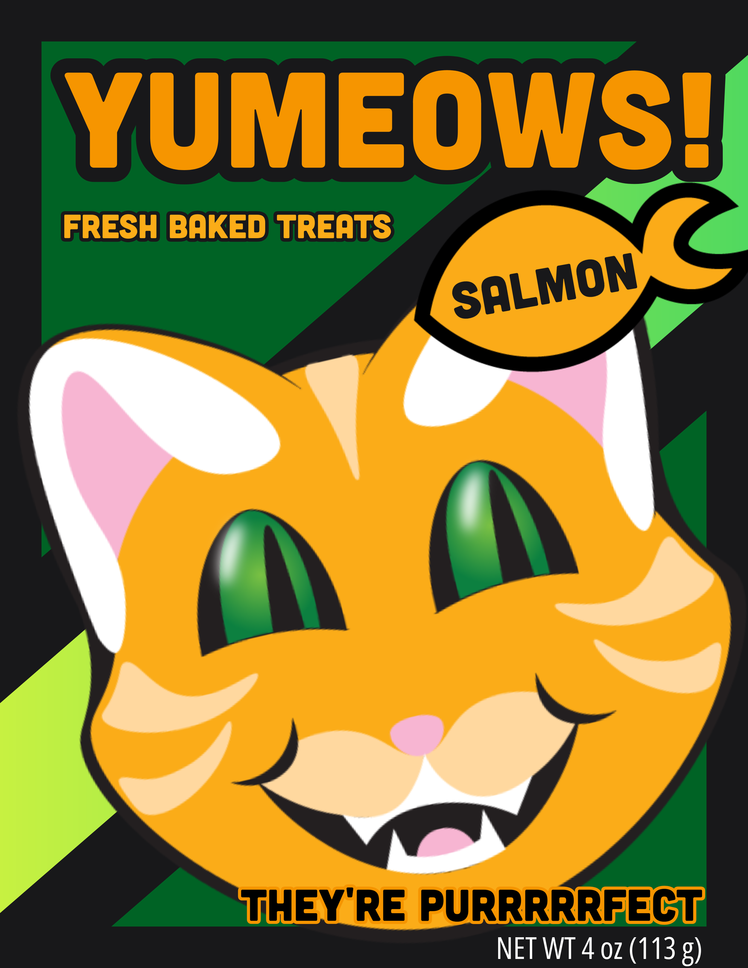
Yumeows! Cat Treat Packaging Concept
Yumeows! is a playful branding and packaging concept for a fictional line of oven-baked cat treats. The idea for the project came from a simple, personal moment: watching my own cats one night and thinking about how expressive and food-motivated they can be. Their personalities inspired the concept of a cheerful mascot-driven brand built around the excitement cats show when they know treats are coming.
The name “Yumeows!” combines the words yum and meow, creating a fun and memorable brand name that immediately communicates both food and feline personality. I designed a friendly orange cat mascot to serve as the visual centerpiece of the packaging. The character interacts with the flavor icon on the package, creating a playful narrative that suggests the cat is eager to enjoy the treat.
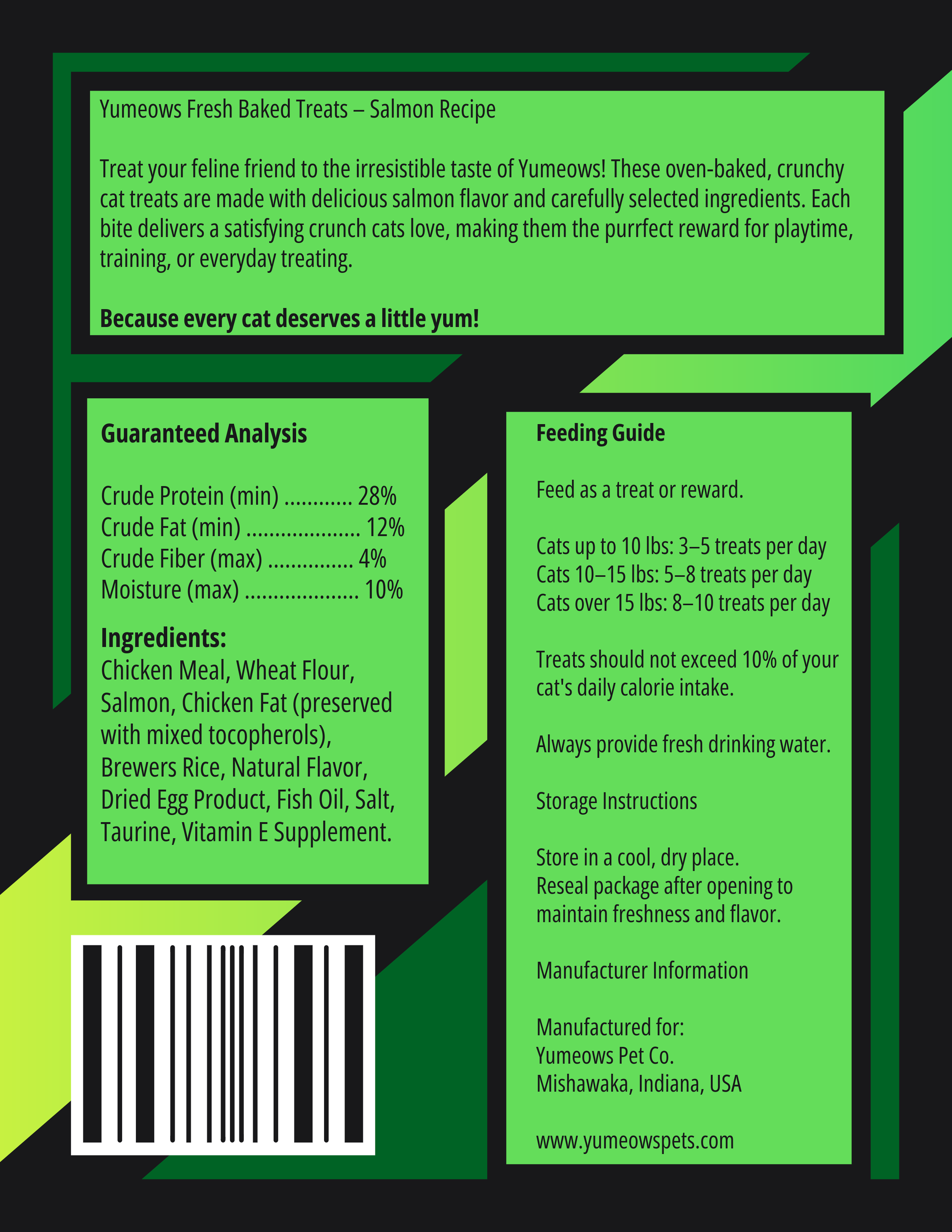
The visual style emphasizes bold shapes, bright colors, and high contrast so the product would stand out on a retail shelf. The green and orange palette reinforces a sense of freshness while maintaining strong readability. The design also includes typical packaging elements such as nutritional information, ingredients, feeding guidelines, and barcode placement to make the concept feel realistic and production-ready.
This project was created as an exercise in brand